echt jetzt Brand Refresh
Type
Client
Sector
Tasks
Year
Credits
Agency: Studio ONOM
Art Direction: Maxi Mayer
Info
echt jetzt doesn't celebrate what you can't eat. They celebrate what you can. But the brand didn't feel like it anymore — so they asked us for a branding refresh. Keep what people recognize, change everything around it.
The core logo stayed, but we took it apart. The speech bubble was pulled out of the original mark and given a bright yellow drop shadow — same mark, read differently.
The biggest shift was color. Gluten-free tends to look like something you have to eat rather than something you want to, and white with a single yellow accent wasn't helping. Six core tones replaced it, so that opening an echt jetzt parcel means opening something colorful.

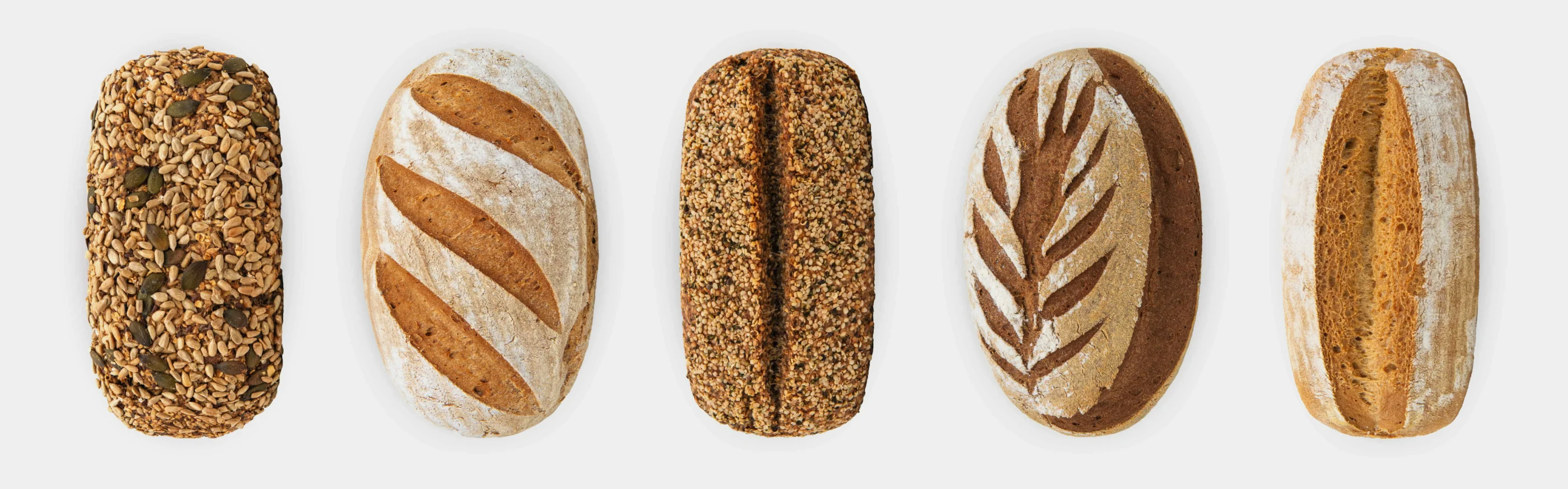
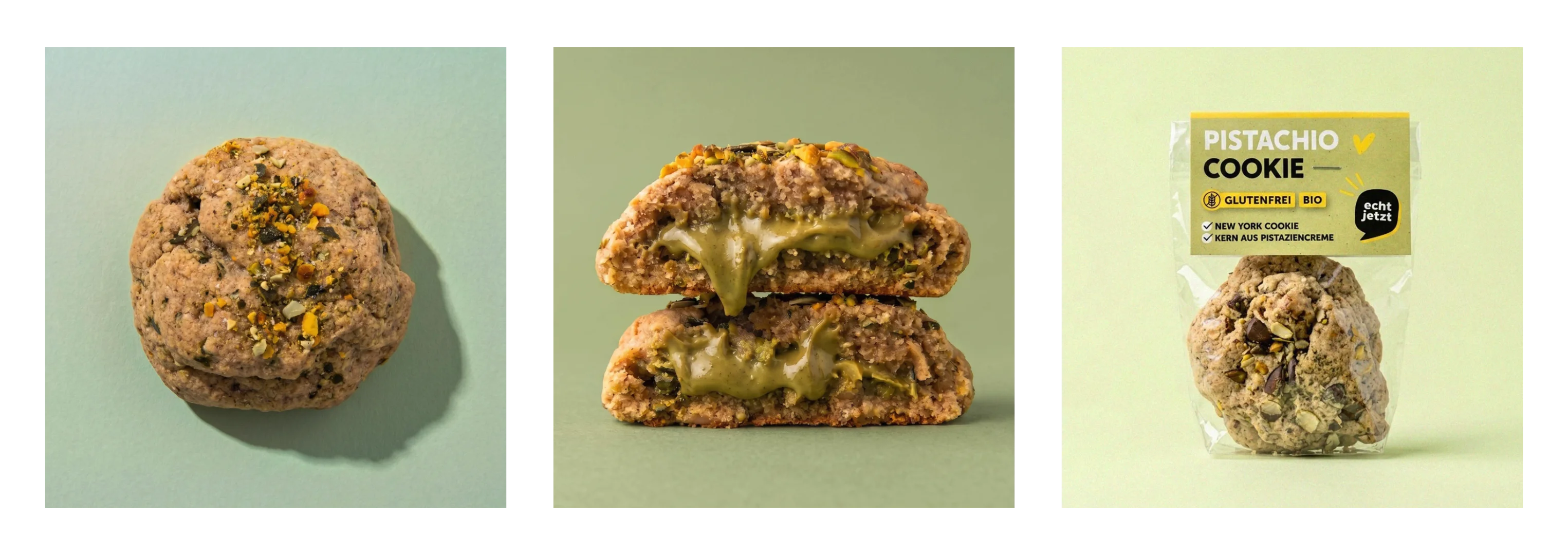
But the brand has to hold two audiences at once: people who have been buying gluten-free for decades, and people just discovering it. Color alone would have been loud but not credible, so the product photography went the other way: reduced, geometric, shot on neutral grey, with a colored backdrop only where a product needs to stand out. The color makes you look. The photography makes you trust it.

Credits
Agency: Studio ONOM
Art Direction: Maxi Mayer
Info
echt jetzt doesn't celebrate what you can't eat. They celebrate what you can. But the brand didn't feel like it anymore — so they asked us for a branding refresh. Keep what people recognize, change everything around it.
The core logo stayed, but we took it apart. The speech bubble was pulled out of the original mark and given a bright yellow drop shadow — same mark, read differently.
The biggest shift was color. Gluten-free tends to look like something you have to eat rather than something you want to, and white with a single yellow accent wasn't helping. Six core tones replaced it, so that opening an echt jetzt parcel means opening something colorful.
But the brand has to hold two audiences at once: people who have been buying gluten-free for decades, and people just discovering it. Color alone would have been loud but not credible, so the product photography went the other way: reduced, geometric, shot on neutral grey, with a colored backdrop only where a product needs to stand out. The color makes you look. The photography makes you trust it.